May the 4th be with you…
Every Star Wars fan knows what today is. Today’s date has been coined “May the 4th be with you” in honor of the classic film franchise for the past several years. Much like a Jedi mind trick, there comes a time when users discover a URL and are led astray to a 404 page.
The dreaded 404 not found message.

Not quite the blue screen of death, but definitely unwelcome when you’re trying to find something on the Internet.
These aren’t the pages you are looking for — a 404 is a web page you typically receive when you land on a page that’s been deleted or removed. Move along.
From a marketing perspective, why should you care?
An error page is actually an opportunity for you to turn a negative into a positive. An inspired 404 improves usability, can reinforce your brand, and turns something unwelcome into an informative, even entertaining contact point at a time when a site visitor least expects it.
One of our favorite 404 pages is from Ready to Go Survival.
The Copy
“Oops! Looks like this page got lost in the Matrix. You take the blue pill, and the story ends, you end up on our homepage and believe whatever you want to believe. You take the red pill, you stay in wonderland, and I show you how deep your preps can go.”
This page’s design is complete with an image of Optimus Prime holding a blue and red pill, because why not go ALL IN?
Quite a contrast from your typical 404, eh?
Ready for more? Here are a few crowd faves we couldn’t help but share.
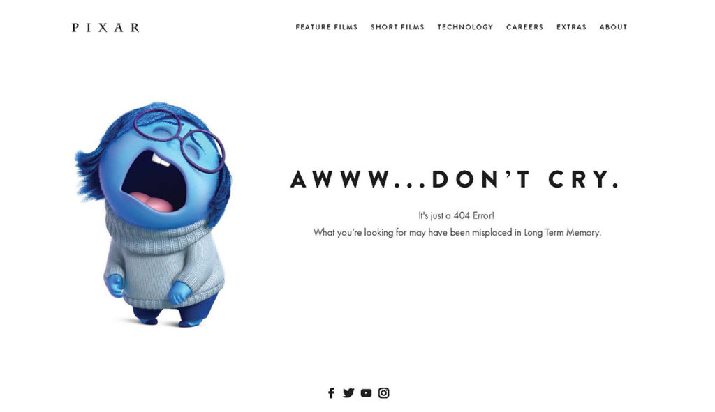
Pixar
Using the character Sadness from the movie Inside Out, Pixar highlighted the frustration we all feel when we end up at a dead end search.

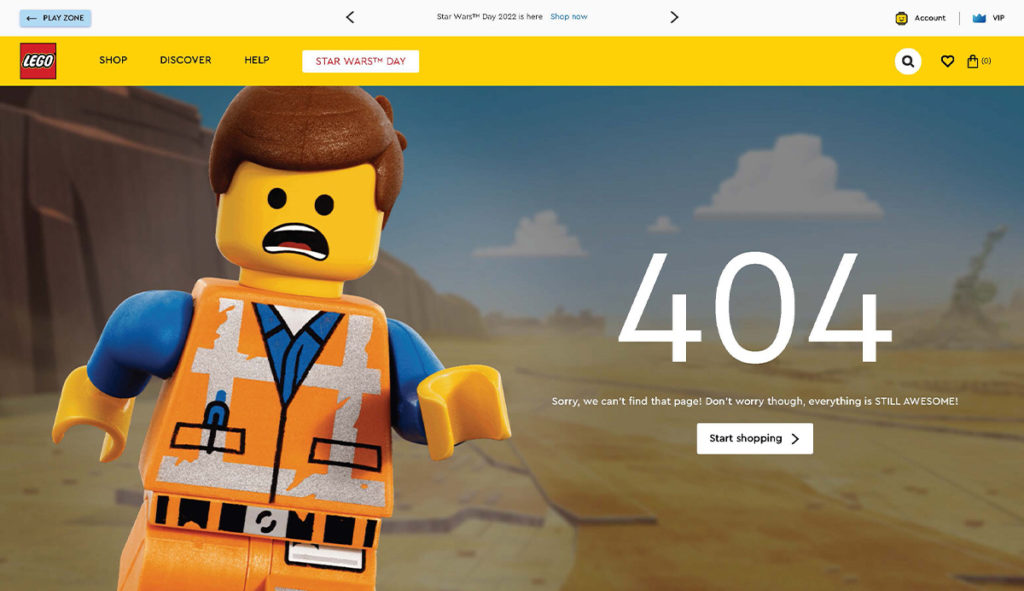
Lego
Pulling inspiration from the Lego Movie, this error page is here to let you know even though you ended up on the wrong page, everything is still awesome.

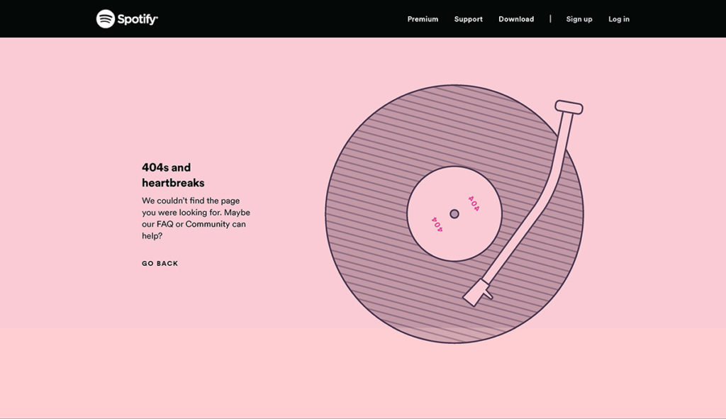
Spotify
Referencing Kanye West’s album “808s and Heartbreak,” Spotify created a clever pun with a “404s and heartbreaks” page. We’re honestly mad we didn’t think of this one first.

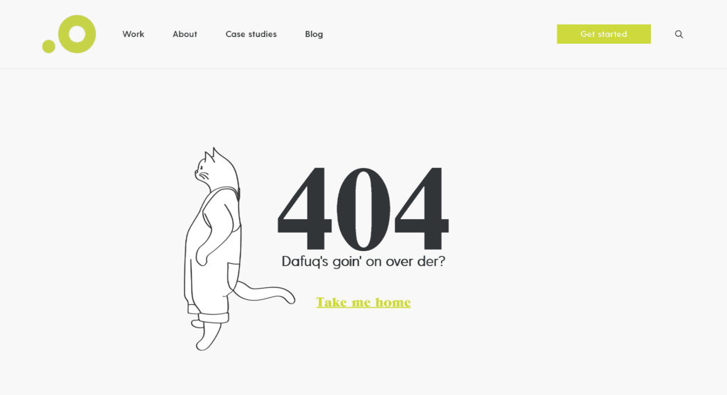
Outsource Marketing
And here’s another favorite – the page you’ll land on if you have a typo or a dead page on our own website:
Creating 404 pages that more than make up for their errors
Sure great design and a sense of humor go a long way in crafting the perfect 404 page, but a few other pointers will help you and your site visitors get the most out of the experience.
So, first…
- Keep it simple. Excess copy or design elements can cloud your message’s delivery.
- Don’t go crazy with redirect options. Offer one to two options for users to move on from your error page.
- Think outside the box. Maybe linking back to the homepage isn’t your best move? Get creative and have a button that downloads an app, a link to a product page, or customer support. The possibilities are endless.


