Bring on the rebranding projects
We’ve handled countless rebrands over the last 25 years, so yeah, we love a good branding project. There’s a certain level of risk involved when you rebrand a prominent brand because, over the years, they’ve developed an identity and audience with their existing branding. Change isn’t always a good thing (believe it or not, we’ve urged clients not to rebrand), so every rebranding project must be well thought-out and executed. (Don’t get us started on NBC’s logo rebrand.) Now, let’s get into it.
Dunkin’ Donuts goes Dunkin’
If you grew up with Dunkin’ Donuts, it might sting to see them switch up their name and branding. But once you get past the initial shock of the name change to “Dunkin’,” along with their fresh and bold design elements, it makes sense. For the same reason, Starbucks dropped “Coffee” from their name: now they aren’t associated with just their signature product. One of the more humorous parts of this rebrand was the advertisements stating, “just call us Dunkin’,” like a kid changing their name in high school. But hey, it worked.
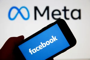
From Facebook to the Metaverse
Is this our favorite rebranding project? We like the simplicity of the new mark, but no. Has it gotten everyone talking? Yes. When Facebook announced the surprising move to the Metaverse, it was the turning point many stakeholders had been waiting for. The Metaverse creates a 3D virtual world that can do everything from playing VR games to hosting meetings while giving Facebook a futuristic makeover. (Look out, TikTok?) This rethink of the Facebook model and brand also brought on thousands of new employees to inspire and revamp beyond its one-dimensional social media offering.
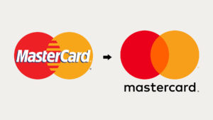
A “priceless” rebrand for MasterCard
MasterCard is one of those iconic brands that we all recognize. While there’s something timeless about not touching a tried-and-true logo, a subtle refresh can do wonders. MasterCard did a great job of keeping its recognizable red and yellow circles but giving it a clean, modern feel that competes with the newer brands, and we love it.
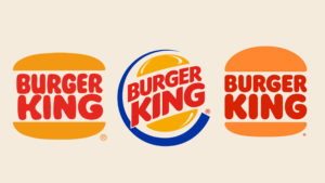
Burger King hitting us with a throwback
Even kings need to keep up with the times, right? After 20 whopping years (get it?), Burger King was finally ready to serve up some branding updates. Burger King ditched its 1999 flashy design for a retro design that was revamped from the ’70s. Are they pulling on our nostalgia heartstrings? We think so.
Adobe Creative Cloud getting more creative
Out of all the rebranding projects, this one made the most sense. For a company that hinges on creativity, a red and white logo was just ‘blah.’ Wanting to encompass all the different products in the Adobe Creative Cloud, the new rainbow gradient logo represents bringing all their programs together.
Launching a successful company rebrand
When it comes to rebranding, you need to know what to keep and what to change. Unless you’re walking away from a branding dumpster fire, you need to understand:
- What your meaningful differences are, and how they’re expressed
- What your competitors are doing
- What people like about your brand, and why
- The components of your brand that resonate
- Where your brand is lacking
Once all those details are clearly defined, you can break into the rebranding process.


